Kiko Kostadinov
Kiko Kostadinov
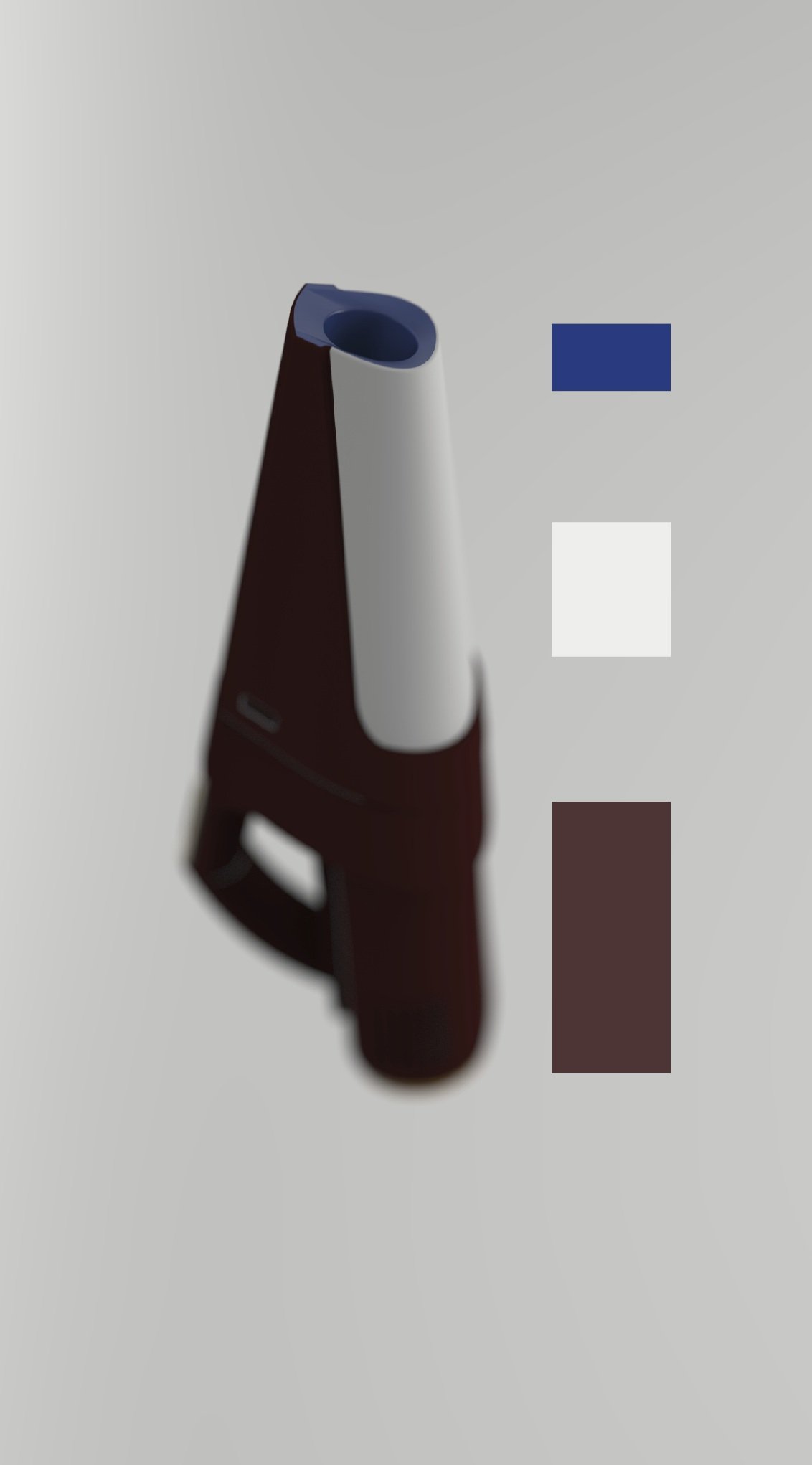
Final Color Palette
Kiko Kostadinov
This color study channels the cerebral, utilitarian essence of the clothing brand Kiko Kostadinov, using both visual research and material tactility to ground the palette in the brand’s ethos. The selected Pantone shades represent a tension between function and futurism with restraint and saturation. Together, they express the brand’s approach to avant-garde tailoring and modular, tech-inspired fashion.
To bring these colors into a physical design context, I sourced material samples that embody the depth of each shade from matte polymers to grained leathers. Each sample was chosen not only to match each hue and value, but also to echo the brand’s sensory language — structured and subdued with deliberate contrasts.


PANTONE Black 6 C

PANTONE 19-4055 TCX

PANTONE PQ-10101C

PANTONE 16-0847

PANTONE 19-1317 TCX
Color Proportions


Color Application
